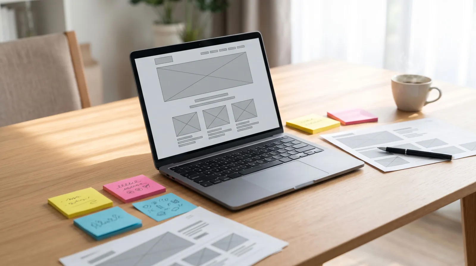
A landing page has one job: turn a visitor from an ad, email or post into a lead or customer. This guide covers 21 landing page best practices across strategy, copy, design, forms, speed, trust and testing, with a comparison of landing pages and home pages, a pre-launch checklist and common mistakes. Follow them and you will waste less ad spend and win more conversions from the same traffic.
You can spend thousands on ads and still lose most of the people who click. The reason is usually not the ad. It is the page people land on. Following landing page best practices is one of the fastest, cheapest ways to grow a business online, because every improvement multiplies the value of the traffic you already pay for.
This guide is written for small and growing businesses anywhere in the world, whether you sell software in the United States, run a dental practice in the United Kingdom, offer courses in Australia or manage an online store in Canada. You will learn 21 proven practices, see what to put above the fold, how to write copy and design forms that convert, and how to test your way to better results. There is also a pre-launch checklist you can copy.
What Is a Landing Page?
A landing page is a standalone web page built for a single campaign goal, such as booking a demo, downloading a guide, claiming an offer or buying one product. Visitors usually arrive from a specific source: a search ad, a social post, an email or a QR code.
What makes it different from a regular web page is focus. A home page introduces your whole business and lets people explore. A landing page removes distractions and guides one type of visitor to one action.
Landing Page vs Home Page
| Feature | Home page | Landing page |
|---|---|---|
| Purpose | Introduce the whole business | Drive one specific action |
| Audience | Everyone | Visitors from one campaign or segment |
| Navigation | Full menu | Minimal or none |
| Calls to action | Many | One primary action |
| Content | Broad overview | Focused on one offer |
| Typical conversion rate | Lower | Higher |
| Best use | Brand discovery, direct visits | Ads, email, social and seasonal campaigns |
Why Landing Page Best Practices Matter
Ad costs keep rising. In Google Ads, landing page experience is one of the factors behind a keyword's Quality Score. Google's own help article on landing page experience explains that this status shows whether your page is likely to give people who click your ad a good experience. A better page can mean better ad positions and lower costs per click.
Most visitors are on mobile. DataReportal's Digital 2026 Global Overview Report shows that the overwhelming majority of the world's 6 billion internet users go online with a mobile phone. A page that looks good on a laptop but frustrates on a phone loses most of its audience.
Speed is still a weak point. The HTTP Archive 2025 Web Almanac reports that only 48% of mobile sites pass Google's Core Web Vitals. A fast landing page gives you an immediate edge over slower competitors.
Strategy Best Practices
1. Define one goal per page
Decide the single action you want visitors to take. If you have two offers, build two pages. Pages with several competing goals confuse visitors and lower conversions.
2. Know exactly who the page is for
Write for one audience segment at a time. A page for small restaurant owners should look and sound different from a page for corporate procurement teams, even if the product is the same.
3. Match the message to the source
Visitors should instantly recognise that they are in the right place. If your ad promises "Free 30-minute website audit," your headline should repeat that promise. Message match reassures people that they made a good click.
4. Create separate pages for separate campaigns
Different ads, keywords and audiences deserve different pages. Even small changes, such as mentioning the visitor's industry or location, can improve relevance.
Copywriting Best Practices
5. Write a clear, benefit-led headline
Your headline should explain the main benefit in plain language within a few seconds. Compare "Innovative Digital Solutions" with "Get More Bookings From Your Website in 30 Days." The second tells the visitor exactly what they gain.
6. Support it with a specific subheadline
Use the subheadline to add detail: who it is for, how it works, or what makes it different. Keep it to one or two sentences.
7. Focus on benefits, not just features
Features describe what something is. Benefits explain why it matters. "Automatic backups" is a feature; "Never lose your website if something goes wrong" is the benefit. Use both, but lead with benefits.
8. Make your copy easy to scan
Most visitors skim. Use short paragraphs, bullet points, bold key phrases and clear subheadings. Every section should earn its place.
9. Answer objections before they arise
Think about what stops people from acting: price, time, risk, trust. Address these in the copy or a short FAQ section. "No credit card required," "Cancel anytime" and "Setup in 10 minutes" remove friction.
Design Best Practices
10. Put the essentials above the fold
The first screen should include the headline, a short supporting line, a relevant image or video, and the main call to action. Visitors should understand the offer without scrolling.
11. Use one prominent call-to-action button
Make the button stand out with a contrasting colour and enough white space around it. Use action-focused text such as "Get My Free Quote" rather than "Submit." Repeat the same CTA further down long pages.
12. Remove distractions
Hide or minimise the main navigation menu, extra links and unrelated offers. Every exit route is a chance for the visitor to leave without converting.
13. Use visuals that show the outcome
Show your product in use, a real result, or the experience customers get. Authentic photos of your team, work or customers usually outperform generic stock images.
14. Design mobile-first
Start with the mobile layout, then expand for larger screens. Use large tap targets, readable font sizes, short forms and sticky CTA buttons where appropriate.
15. Build in accessibility
Good contrast, descriptive buttons, clear labels and keyboard-friendly forms help every visitor and can be legally required in some regions. The W3C's Web Content Accessibility Guidelines are the global reference standard.
Form Best Practices
16. Ask only for what you need
Each extra field adds effort. For lead generation, name and email are often enough at the first stage. Collect more details later in the sales process.
17. Use multi-step forms for longer requests
When you genuinely need more information, such as for a quote, break the form into short steps. Start with easy questions and save sensitive ones for later. Show a progress indicator so visitors know how much is left.
18. Reduce typing
Use dropdowns, checkboxes and buttons where possible. Enable autofill. Validate fields as people type so errors are fixed immediately, not after clicking submit.
| Form approach | Best for | Pros | Cons |
|---|---|---|---|
| Single short form (2–3 fields) | Newsletters, guides, simple enquiries | Fast, low friction | Less qualifying information |
| Multi-step form | Quotes, bookings, demos | Feels easier, captures more detail | More complex to build |
| Long single-page form | Applications, detailed projects | All information at once | Higher drop-off |
| Click-to-call or chat | Urgent local services | Instant contact | Harder to track and scale |
Trust and Performance Best Practices
19. Add authentic social proof
Use real testimonials with names, roles, photos and specifics. Add review ratings, client logos (with permission), case study results or the number of customers served. Specific proof such as "Bookings up 42% in three months" beats vague praise.
20. Make it fast
Compress images, avoid heavy scripts and limit third-party widgets. Test with Google PageSpeed Insights and aim for good Core Web Vitals on mobile. A page that loads in two seconds will convert better than an identical page that loads in six.
21. Test, measure and keep improving
Best practices are a starting point, not the finish line. Track conversions properly, then test one change at a time: headline, CTA text, hero image, form length or page layout. Keep the winner and test again. Our guide to conversion rate optimization for small business explains how to run tests even with modest traffic.
5 Headline Formulas for Landing Pages
A strong headline does most of the work on a landing page. These formulas are easy to adapt to any industry:
Get [desired result] without [common pain].
"Get a Professional Website Without a Large Upfront Cost."
[Number] [audience] use [product] to [result].
"2,000 Small Clinics Use Our System to Fill Their Calendars."
The [adjective] way to [achieve goal].
"The Fastest Way to Send Accurate Quotes."
[Result] in [timeframe].
"Your New Booking Page, Live in 10 Days."
Stop [problem]. Start [benefit].
"Stop Chasing Invoices. Start Getting Paid on Time."
Write five to ten versions, read them aloud, and pick the one a stranger would understand fastest. Then test it against your second favourite.
Before and After: Landing Page Copy Examples
Small wording changes can make a big difference. Here are common weak phrases and stronger alternatives:
| Element | Weak version | Stronger version |
|---|---|---|
| Headline | Welcome to Our Services | Fix Your Leaking Roof in 48 Hours, Guaranteed |
| Subheadline | We are a leading provider of solutions | Licensed local roofers with 1,200+ five-star reviews |
| CTA button | Submit | Get My Free Roof Inspection |
| Benefit bullet | High-quality materials | Materials backed by a 20-year warranty |
| Form heading | Contact Us | Tell Us About Your Roof: We Reply Within 2 Hours |
| Social proof | Customers love us | "They fixed our leak the same day." – Maria, homeowner |
How to Measure Landing Page Performance
Track these metrics for every landing page and review them at least monthly:
| Metric | What it tells you | What to do if it is weak |
|---|---|---|
| Conversion rate | Share of visitors who complete the goal | Test headline, offer, CTA and form |
| Bounce or engagement rate | Whether visitors stay and interact | Improve message match and above-the-fold content |
| Form start vs completion | Where people abandon forms | Remove fields or split into steps |
| Scroll depth | How far people read | Move key content and CTAs higher |
| Page load time on mobile | Whether speed is costing you visitors | Compress images, remove heavy scripts |
| Cost per conversion | Whether the page is profitable | Improve conversion rate or refine targeting |
Do Landing Pages Help SEO?
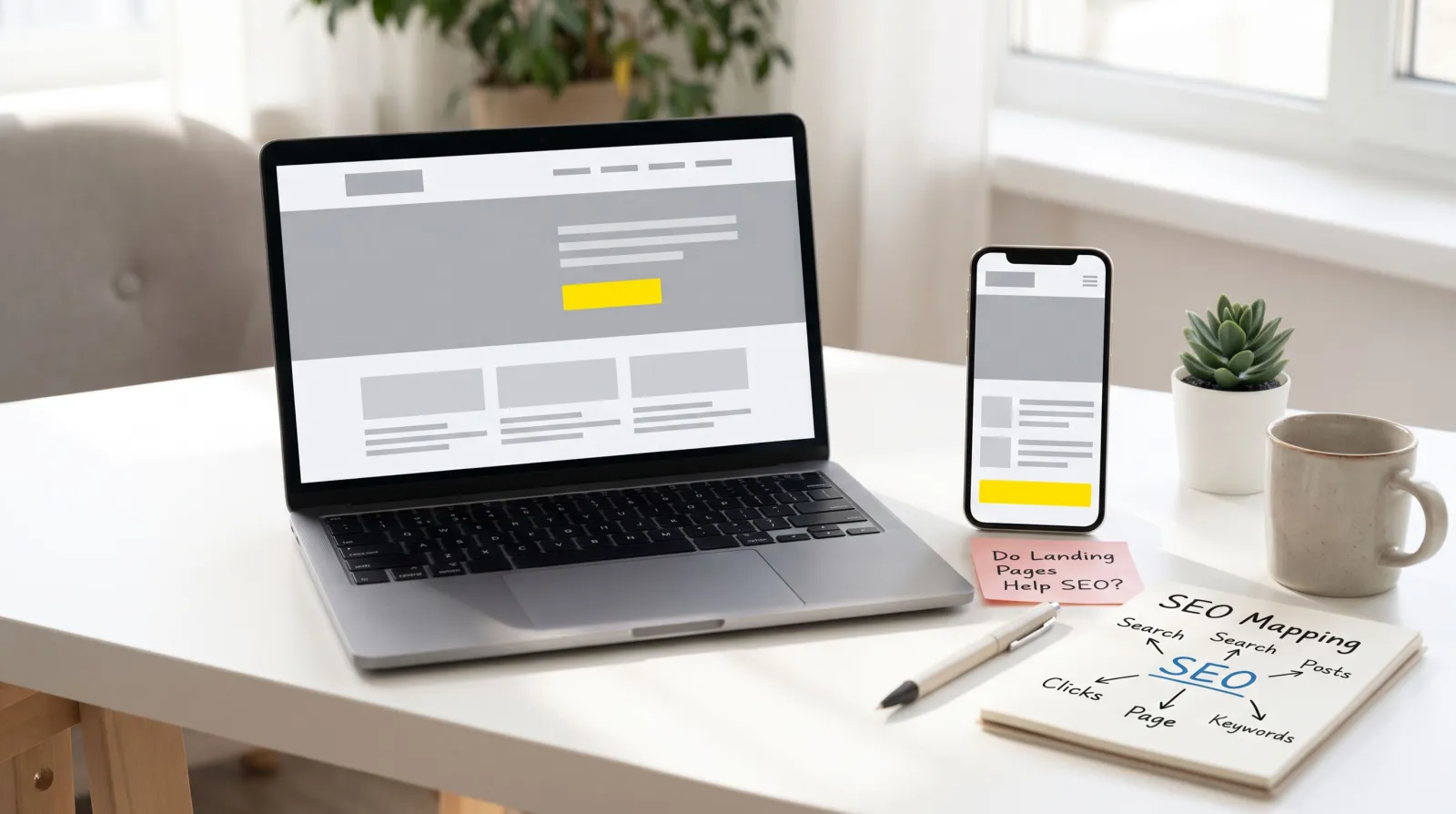
Most campaign landing pages are designed for paid or email traffic, so they are short and focused. That is fine. However, some landing pages, such as service pages or location pages, can also rank in search. For those, include more helpful detail, answer common questions, use descriptive headings and link to related content on your site. Keep paid-only variants out of search results with a "noindex" tag to avoid duplicate content.
Want a landing page built around these principles without doing it yourself? Get a free design preview from our team and see your page before you commit.
Should You Use Video on a Landing Page?
Video can explain a complex product quickly, show a service in action or put a friendly face to your business. Short explainer videos of 60 to 90 seconds, customer testimonial clips and quick product demos tend to work best. Keep these rules in mind:
Do not auto-play with sound; let visitors choose to watch.
Use a lightweight video player or a click-to-load thumbnail so the page stays fast.
Add captions, since many people watch on mute.
Make sure the page still converts for visitors who never press play.
Personalisation and Dynamic Content
Showing slightly different content to different visitors can lift conversions. Simple, low-cost options include:
Matching the headline to the search keyword or ad group
Showing industry-specific examples and testimonials for different audience segments
Displaying local details, such as city names or service areas, for location-based campaigns
Greeting returning email subscribers with a tailored offer
Start with one or two variations for your highest-spend campaigns before personalising everything.
Build It Yourself or Get Help?
Drag-and-drop builders make it possible to publish a landing page in an afternoon, and that is a good way to test an idea quickly. As your campaigns grow, a professionally built page often pays for itself through faster load times, cleaner tracking, stronger copy and easier integration with your website, CRM and analytics. The right choice depends on your time, skills and how much traffic you are paying for. A useful rule: if you spend more each month on ads than a professional page would cost, it is worth getting expert help.
Anatomy of a High-Converting Landing Page
Use this structure as a starting template for most lead generation pages:
Hero section:
headline, subheadline, visual and primary CTA
Problem section:
a short description of the pain your visitor feels
Solution and benefits:
three to five key benefits with icons or short bullets
How it works:
a simple three-step process
Social proof:
testimonials, ratings or results
Offer details:
what is included, pricing or starting price
FAQ:
answers to the top objections
Final CTA:
repeat the main call to action
Landing Page Best Practices by Campaign Type
| Campaign type | Primary goal | What to emphasise |
|---|---|---|
| Search ads (PPC) | Lead or sale | Exact message match with keyword and ad, fast load, clear CTA |
| Social media ads | Lead or sign-up | Strong visual, short copy, mobile-first layout, social proof |
| Email campaigns | Re-engagement or upsell | Personalised offer, existing-customer benefits, one-click actions |
| Event or webinar | Registration | Date, time zone, speakers, agenda, short form |
| Product launch | Pre-orders or waitlist | Benefits, launch offer, urgency, visuals of the product |
| Local services | Calls or bookings | Click-to-call, service area, reviews, availability |
Lead Generation vs E-commerce Landing Pages
Lead generation pages aim to start a conversation. They work best with a free, low-risk offer (consultation, quote, guide or trial), short forms and strong trust signals.
E-commerce landing pages aim for an immediate purchase. They need clear pricing, product images from several angles, shipping and returns information, secure checkout badges and a fast path to the cart. Hidden costs are one of the most common reasons shoppers abandon a purchase, so show delivery costs early.
What Happens After the Click: Thank-You Pages
Many businesses forget the page people see after converting. A good thank-you page confirms the action worked, explains what happens next, and offers a useful second step such as booking a call, downloading a resource, following you on social media or reading a related article. It is also the best place to fire your conversion tracking.
Common Landing Page Mistakes
Sending ad traffic to the home page instead of a dedicated page
Headlines that are clever but unclear
Multiple competing offers on one page
Long forms asking for information you do not need yet
Slow-loading hero images or auto-playing videos
Generic stock photos and anonymous testimonials
No mobile testing before launch
No conversion tracking, so results cannot be measured
Landing Page Pre-Launch Checklist
One clear goal and one primary CTA
Headline matches the ad, email or post that sends traffic
Benefits explained in plain language
Social proof visible near the CTA
Form is as short as possible and works on mobile
Page loads quickly on mobile data
Privacy policy linked near the form
Thank-you page set up with next steps
Conversion tracking tested
Page proofread and checked on several devices
How Southside Devs Builds Landing Pages
Southside Devs designs fast, mobile-first landing pages and websites for small and growing businesses, with hosting, SSL and maintenance included in one flat monthly fee. We build pages around a clear goal, strong copy and clean design, and we connect them to your forms, analytics and tools. Explore our services or contact our team to discuss your next campaign. If your whole site needs a rethink, our website redesign checklist is a good place to start, and our guide on adding an AI chatbot to your website explains another way to capture leads around the clock.
When you are ready to turn more visitors into customers, request a free design preview and see what a focused, high-converting page could look like for your business.
Key Takeaways
Landing page best practices start with one goal, one audience and one clear call to action.
Match your headline to the ad or message that sent the visitor.
Keep copy scannable, benefit-led and focused on removing objections.
Design mobile-first, keep pages fast and remove distractions.
Use short or multi-step forms, authentic social proof and a helpful thank-you page.
Track conversions and keep testing; best practices are a starting point.
Frequently Asked Questions
What makes a good landing page?
A good landing page has a single goal, a clear benefit-led headline, a prominent call to action, relevant visuals, trust signals such as testimonials, a short form and fast loading on mobile devices.
How long should a landing page be?
As long as it needs to be to answer the visitor's questions. Simple, low-cost offers can use short pages. Higher-priced or complex offers usually need longer pages with more detail, proof and FAQs.
Should a landing page have navigation?
Usually not. Removing the main navigation keeps visitors focused on the single action you want them to take. A small logo and a link to your privacy policy are typically enough.
What is a good landing page conversion rate?
It varies widely by industry, offer and traffic source. Instead of chasing an average, benchmark your own page and aim to improve it steadily through testing.
How many CTAs should a landing page have?
One primary call to action, which you can repeat several times on longer pages. Avoid adding different competing actions.
Get Landing Pages That Actually Convert
Southside Devs builds fast, focused landing pages and websites for one flat monthly fee, with no large upfront cost, no long contracts, and hosting, SSL and maintenance included. Get your free design preview today.
Conclusion
Landing page best practices are simple to understand but powerful when applied consistently: one goal, a clear message, a distraction-free design, a short form, real proof, fast loading and continuous testing. Each improvement makes your marketing budget work harder.
Start with the checklist in this guide, fix the biggest gaps first, and test from there. If you want a professional page built for you, get started with Southside Devs and see your new landing page before you commit.